The Friday Face-Off: Abandoned Building

It is not long ago that I have joined the meme The Friday Face-Off, which was originally created by Books by Proxy. Each week bloggers showcase books with covers centred around a weekly theme. You can visit Lynn’s Books for a list of upcoming themes. Join in the fun each Friday by finding a book whose cover is based on the theme!

This week’s theme: “Woe, destruction, ruin, and decay; the worst is death and death will have his day.” – A cover with abandoned buildings

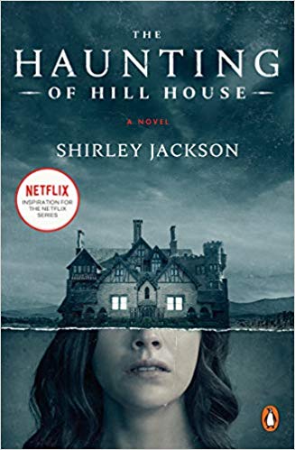
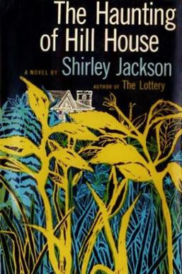
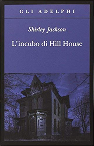
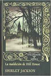
I have thought a lot if one of my favourite books -Shirley Jackson’s The Haunting of Hill House- qualified for this theme. I mean, the building is not permanently inhabited, right? However, it is not abandoned either (a malignant presence dwells there). It fits well the rest, though: death had definitively his day, and then some. So here it is, in all its majesty across many countries and editions, with only one exception: the French cover, which I would have otherwise included (it was the first version I read, after all), does not, strangely enough, feature a house, abandoned or otherwise, but just a (spooky) candelabra. Out.

This was the cover of the original edition back in 1959

10 Comments

  1. @lynnsbooks

    Oh yes, this is a great choice. I thought about using this myself tbh but I’ve used it for a previous theme. I really like the purple cover and the original is very curious isn’t it – almost as though the plants are obscuring the house, trying to blot it out and make everyone forget it exists – but there’s still a little bit peaking above the tops of the plants.
    Lynn 😀

    Reply
    1. Steph P. Bianchini (Post author)

      I agree. I found all the covers creepy in a way or another, reflecting more than well the novel itself 🙂

      Reply
  2. sjhigbee

    I haven’t read this one but it’s an excellent choice, Steph. I like the original with the chunky plants almost screening out the house – even though it has the hated textbox…

    Reply
    1. Steph P. Bianchini (Post author)

      Yes, I agree. The novel is amazing, however, definitively worth a reading!

      Reply
  3. Tammy

    Great choice for the theme, Steph! I love the Penguin edition, it has such an ominous feel to it.

    Reply
    1. Steph P. Bianchini (Post author)

      Agreed! It gave me shivers…

      Reply
  4. Mogsy @ BiblioSanctum

    For once I actually like a film/show adaptation version. I think the design is very clever and spooky!

    Reply
    1. Steph P. Bianchini (Post author)

      I agree it is quite clever and evocative. I find the Italian one, however, so creepy…

      Reply
  5. maddalena@spaceandsorcery

    For some reason, the second cover (used as a template image for the Netflix series as well) never gave me any horror “vibe”, while the first Penguin cover shouts “haunted house!” with a very, very loud voice, mostly for the choice of color and the naked branches in the foreground…
    🙂

    Reply
    1. Steph P. Bianchini (Post author)

      Yes, it is very impressive, isn’t it?

      Reply

Leave a Reply

%d bloggers like this: