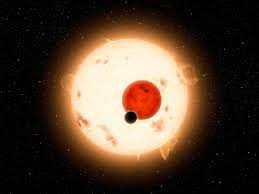

It’s difficult to stay up to date with all the exoplanet discovery (one article of this week was discussing a perfect twin for our planet) and even more to figure them out. This is why animations of the kind Ethan Kruse has coded are so interesting. Have a look at it by yourself:
As an article on Popular Science explains, here “the planets are not drawn to scale compared to the stars and orbits (you wouldn’t be able to see them if they were), and the stars aren’t located this close together in real life. Still, you can see the relative size of the planets as well as an estimate of their temperatures. The animation also underlines something Kepler taught us: that our solar system isn’t the standard model for the galaxy. Before Kepler, scientists thought that other solar systems would be shaped like ours, with small rocky planets on the inside, icy planets on the outside, and gas giants in between. Now we realise that solar systems come in all sorts of shapes and sizes.” (read the full article here).
For more about Kepler and the planetary discovery, see here. Finally, if you are a computer wiz and want your own orrery, you can find here the source code for a good start.


Leave a Reply